Overview
Having the opportunity to build a product from scratch, we knew it was vital for our product to be able to grow easily to construct a system that would allow us to scale, iterate and experiment quickly.
Challenges
One of the biggest challenges was the design and development synchronization as we were working on a full native app which presented it’s own limitations when building components for both iOS and Android platforms. As we were creating a full custom UI that had to be implemented in both systems, using too little native components, it was really difficult at first to propose and build components that performed equally in both. We managed to resolve this by slimming off components and behaviors and creating a workflow that involved creating a custom app for each platform which allowed to review and approve how components were created and behaving before pushing to the app.
Handoff highlights
Early in the process of syncing design and development it was crucial to help developers understand how animations should be implemented. We tried different strategies to make it clear, but prototyping was simply the most efficient way to do it. We defined some basic standard behaviors for the components’ first iteration. At this stage prototyping features in Figma weren’t too advanced which resulted in using ProtoPie to create high-fidelity artifacts.
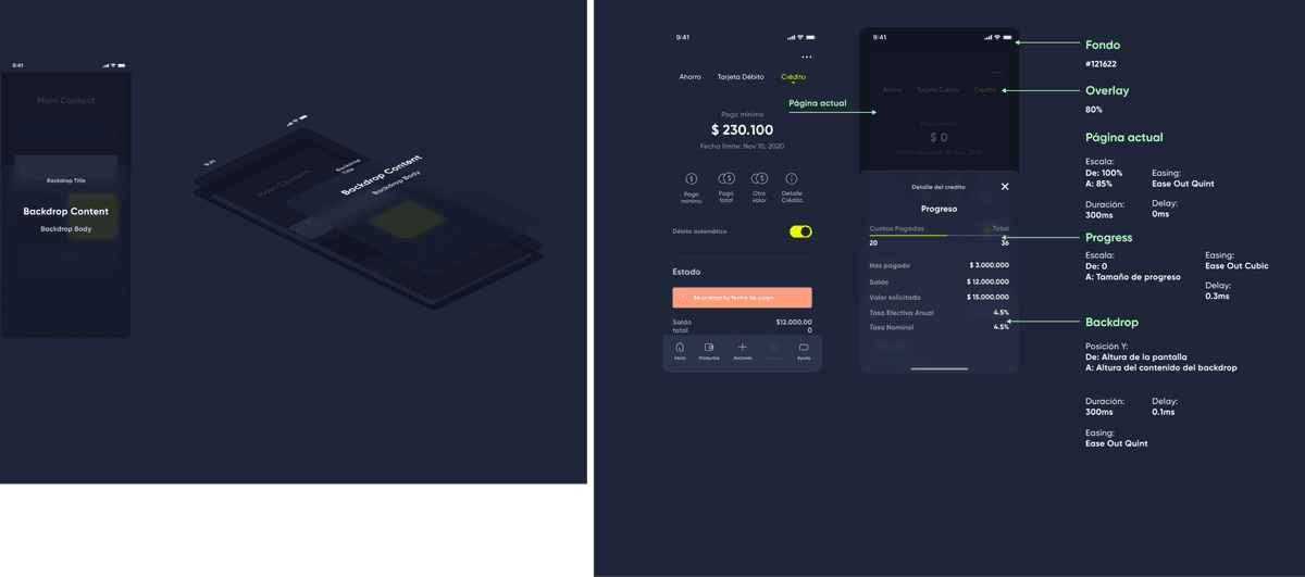
Undestanding the possibilities
In the early stages of the library creation I experimented with building Swift UI components, looking for new ways for the design team to prototype and evaluate what was possible to do in the development team. This was later disregarded as it was difficult at the time for designers to get involved with code and not viable for me as a sole designer to build an entire ecosystem. This was however a great opportunity to learn Swift and understand both how layouts are build in iOS and what’s actually possible to build.
Component iteration
Shortly after stablishing our first library we went through a face-lift that required components to be updated visually. This, however, was also a chance to review the way components were structured as we were facing issues when updating or using them modularly. At the same time, Variants were introduced in Figma, making it a fantastic coincidence to create vanguardist components. We chose some of the most used and complex components to review. This small iterated set would be later the base from which the rest of the library would be updated.
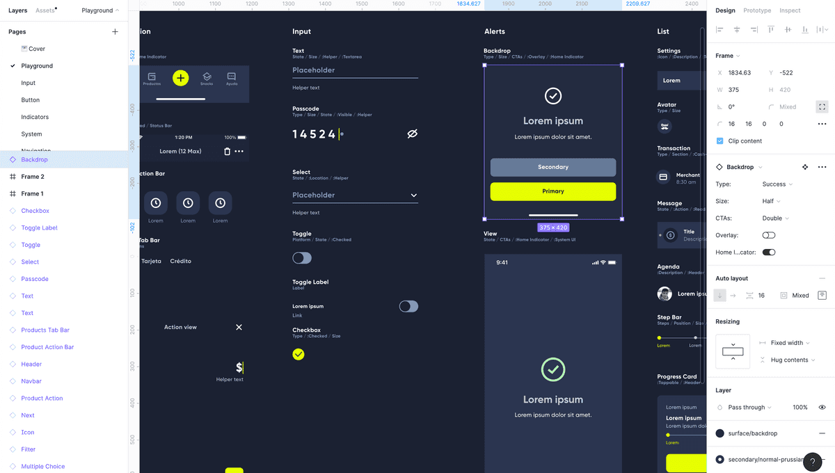
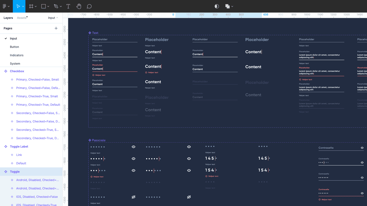
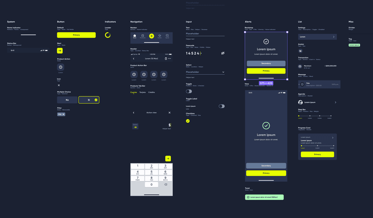
Workflow optimization
Going beyond the component library one of my main objectives while taking care of the Design System was to find ways for the design team and the rest of the organization involved with the library to streamline the way they work with it. This resolved in many opportunities for me to build new tools and workflows that were beneficial for all the teams involved.
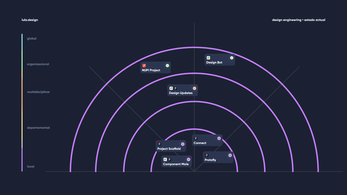
Component Mole
Component Mole was created for the Design Team so they could report component and instance issues directly to Slack. This allowed us to channel all requests into a single output to manage this requests in a more efficient way. I modified this plugin later on for public release, you can try it here.
Protofly
I created a private version of the Protofly plugin to resolve the specific pain of using different animation settings for all of our prototypes in Figma. By using Protofly every designer could use presets that match our interaction guidelines without having to memorize them or play with settings themselves.
NUPI
As a Design Team we set some ground rules when working on unhappy paths, notifications and other types of alerts. This included using a source file for all of our alert-related content. Though this was important for us as a team to keep files clean and avoid clutter, it wasn’t so practical for developers, BAs, legal teams and other members of the organization to understand how these alerts would be displayed in the app. While we had templates linked to the content source file it was so much easier to understand when seeing it on the layout. Looking for a way to balance both worlds I developed a tool called NUPI, which allowed anyone at the organization to preview Alerts within the app layout. This was also a chance to get started using Storybook to layout some components for the web, using React.
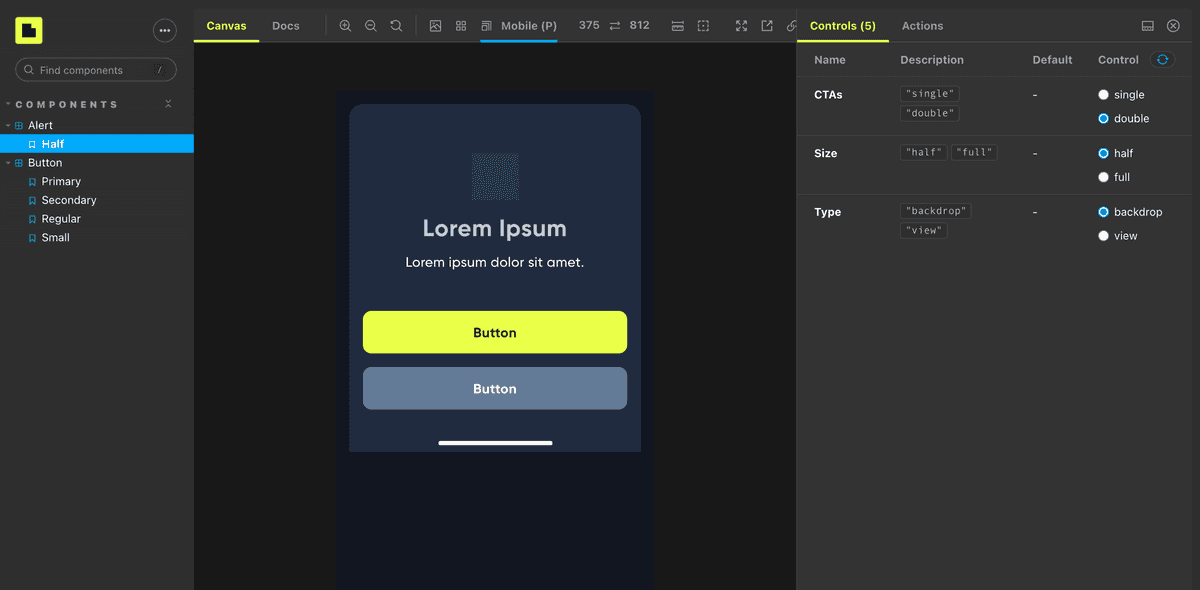
I was heavily inspired by the custom Storybook UI. It felt dashboardy and matched up perfectly with what we wanted to accomplish with this internal tool. NUPI is currently in beta. We decided to share an MVP version of the project to evaluate its usage before going full steam on it.
The Design Principles
As a result of working in a fast-paced environment and lots of changes in decisions and non standardized products, we ended up designing upon a shared but undocumented view of how our product should be designed and what objectives our experience should accomplish. To address this matter I lead the very needed initiative to create our Design Principles. They would not only help the team make better decisions but also be the root of our Design System.
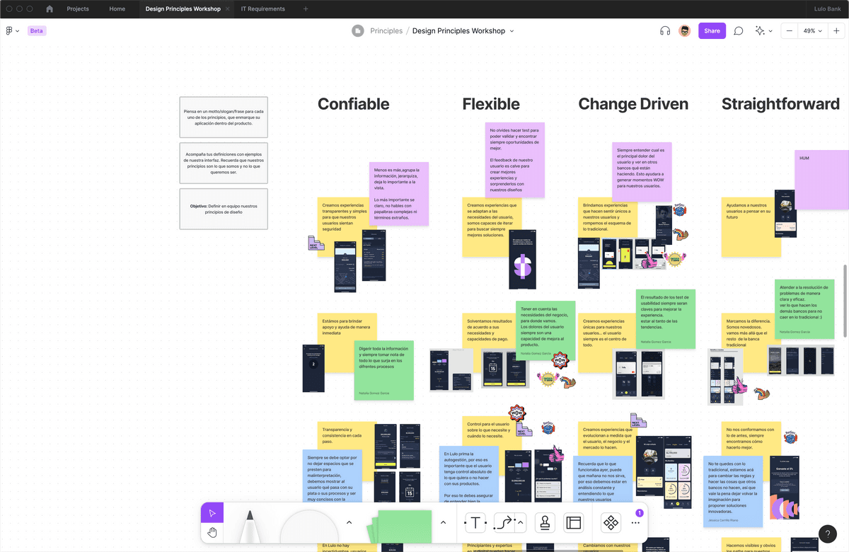
In short, the idea was to build upon what we already did and not an attempt to do it from scratch, nor creating an elaborate concept of what we wish to be, but rather a result of what we’d been able to create for about 2 years.
The result was an outstanding set of principles that resonated so well within the company leadership, accomplishing one of the goals of aligning with the company vision, that the princples were pushed further to be used as company-wide princples.
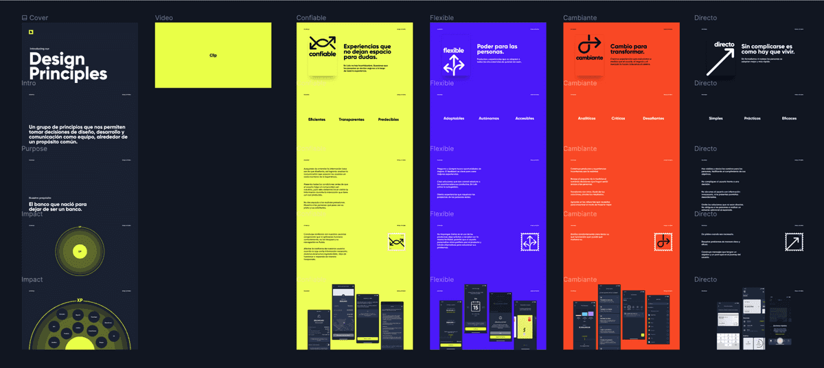
To overcome next
Documenting our components is a continuous process that involves both design and development teams. Currently documentation is managed inside the Figma files. While this may be convenient in some cases, it's hard to navigate, read and might have accessibility issues. We want to make access to the Design System universal. Right now we're working on migrating all documentation to wiki kind of software like Notion, in order to make it more readable, navigate-able and findable within the organization top-level documents.
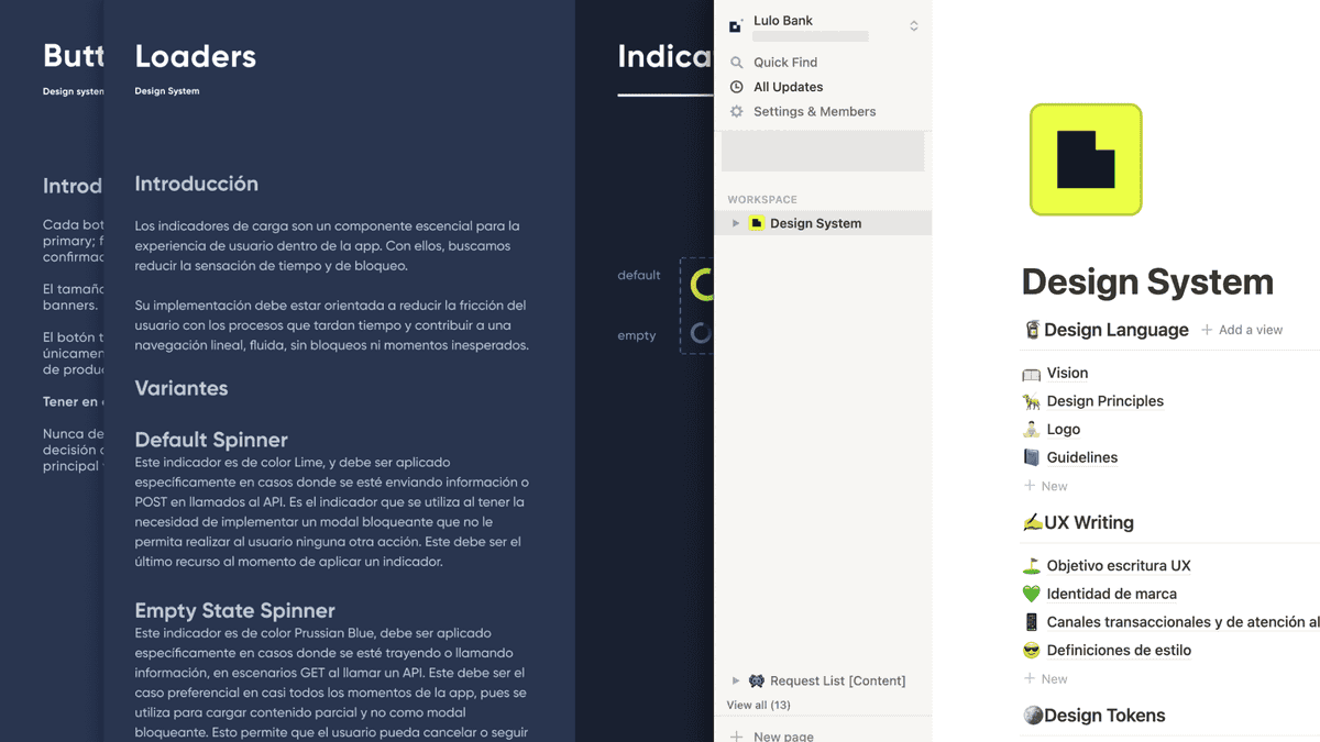
Maintaining, developing and improving the Design System is an endless task. There's a lot of work to be done and the team is looking forward to resolve current and upcoming issues such as contribution, component naming and usage consistency.