What I did
I worked in the Museo de Memoria digital team as both UI Designer and Front End Developer. I was responsible for designing the first iteration of the entire website, other digital products and help in most of the coding process. We wanted to create a super clean interface that was easy to scan, read and understand.
I got the chance to work on content architecture and to create user flows, mobile and desktop mockups and coded prototypes and components.
Insights
In the following years Colombia will begin the construction of the Museo de Memoria de Colombia, a national museum that aims to make visible and promote memories, histories and faces that have experienced armed conflict in Colombia. As part of this massive project, the museum needed a place to share all its work, processes and artistic content at the same time it prepared its first exhibit and public launch at FILBo 2018. This pushed the need for creating its web platform and a series of interactive products for its first local staging. This digital products were fundamental for the Voces Para Transformar exhibit, which took place at FilBo.
Creating the Platform
Architecture
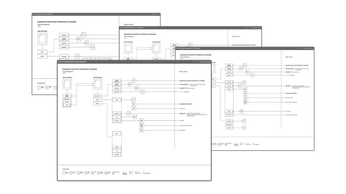
Built on top of history, one of the greates challenges for us was being able to organize the site's content architecure in a way it was both easy to navigate and meeting the expectations of everyone collaborating in the process of bringing relevant information to the project. We worked on and reviewed constantly a lot of the content maps we created to make sure we were achieving our goal of being scannable, readable and easy to understand.
Base components
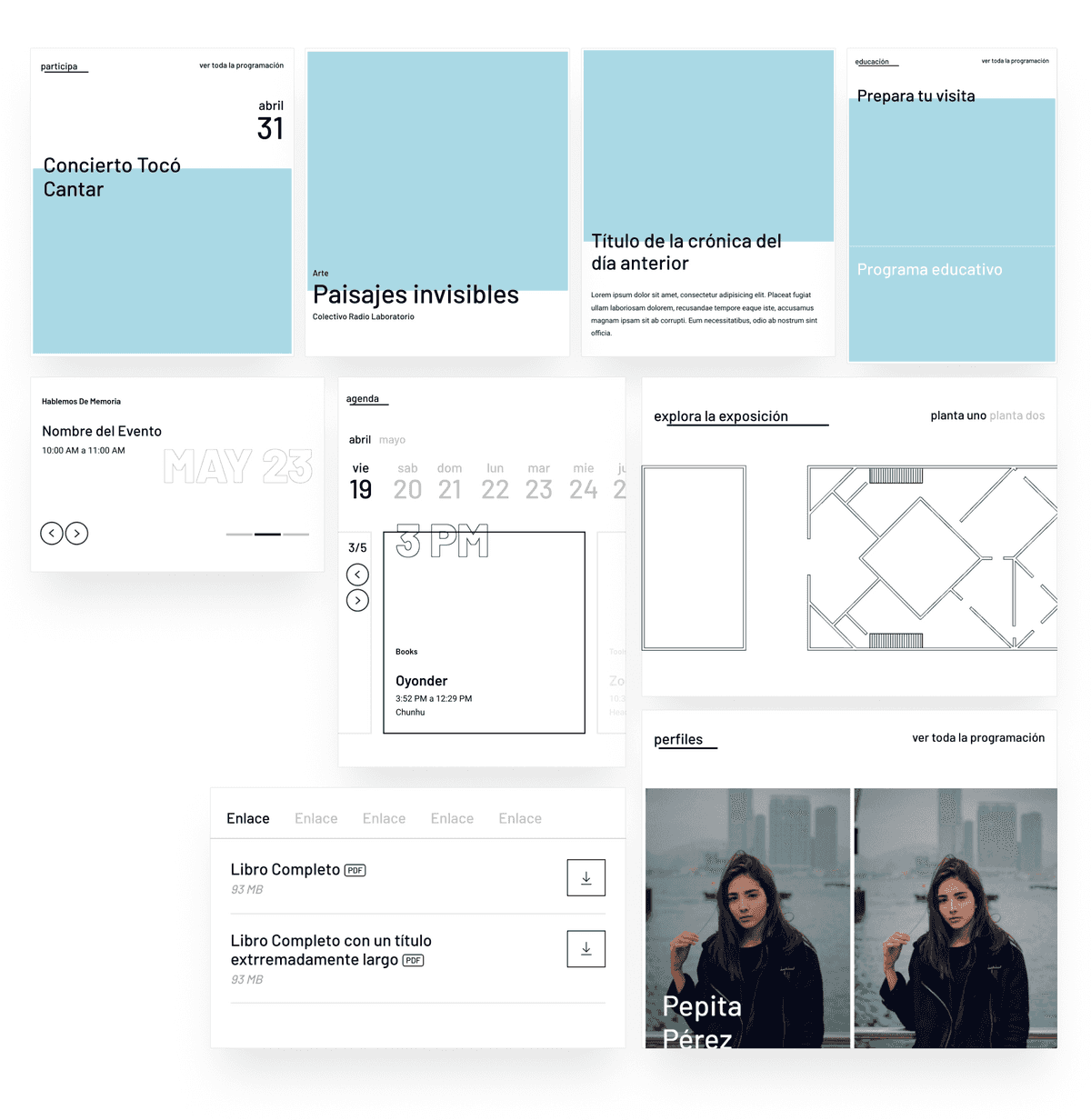
At the time Design Systems weren't something we fully understood, but we knew we needed to have building blocks we would reuse in order to build the platform faster. Having a hybrid role pushed me into both designing and coding some prototype modules that could be easily integrated into the mobile-first production build. I created a public repo for this specific project here.
End product
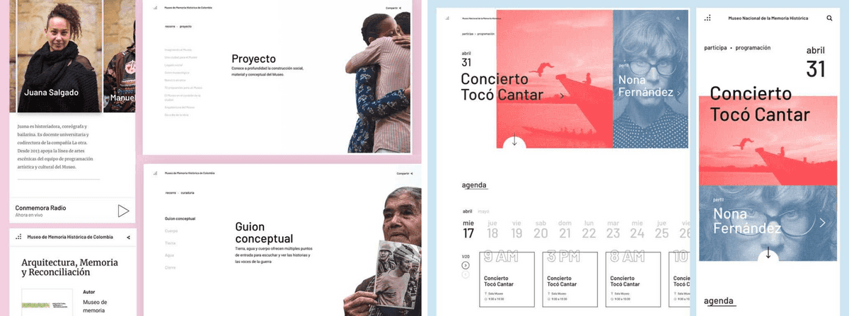
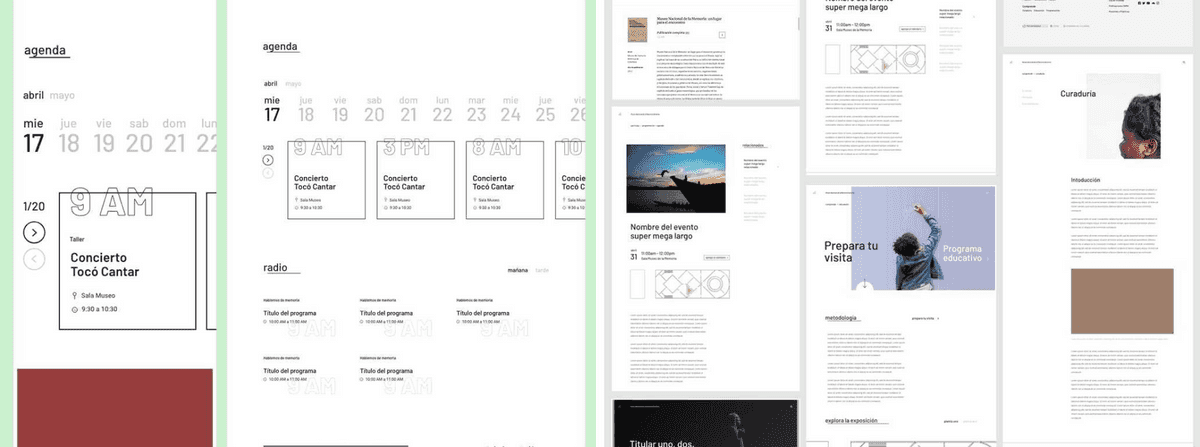
Eventhough we were working on a tight timeframe we managed to deliver a fresh, clean and usable platform that was ready to be used by both exhibit visitors and online users.
We got to create something that reached tons of people in a place where much of the information, history and experiences we wanted to share were invisible. We were able to generate empathy and acknowledgement towards tough but real ongoing issues in the country, hopefully, to alleviate indifference and lack of responsibility that happens in cities and non-rural environments.
This would become the core of the following design iterations over the web platform.
Other products
As part of the museum's ecosystem, the team was in charge of creative other interactive experiences to push further the way people interact with it and learn about the effects and actors of the most important political and social event in Colombia in the 20th century.
We worked in small sites and apps that were available for visitors at the FilBo exhibition and other interfaces that were meant to be launched later in that year.
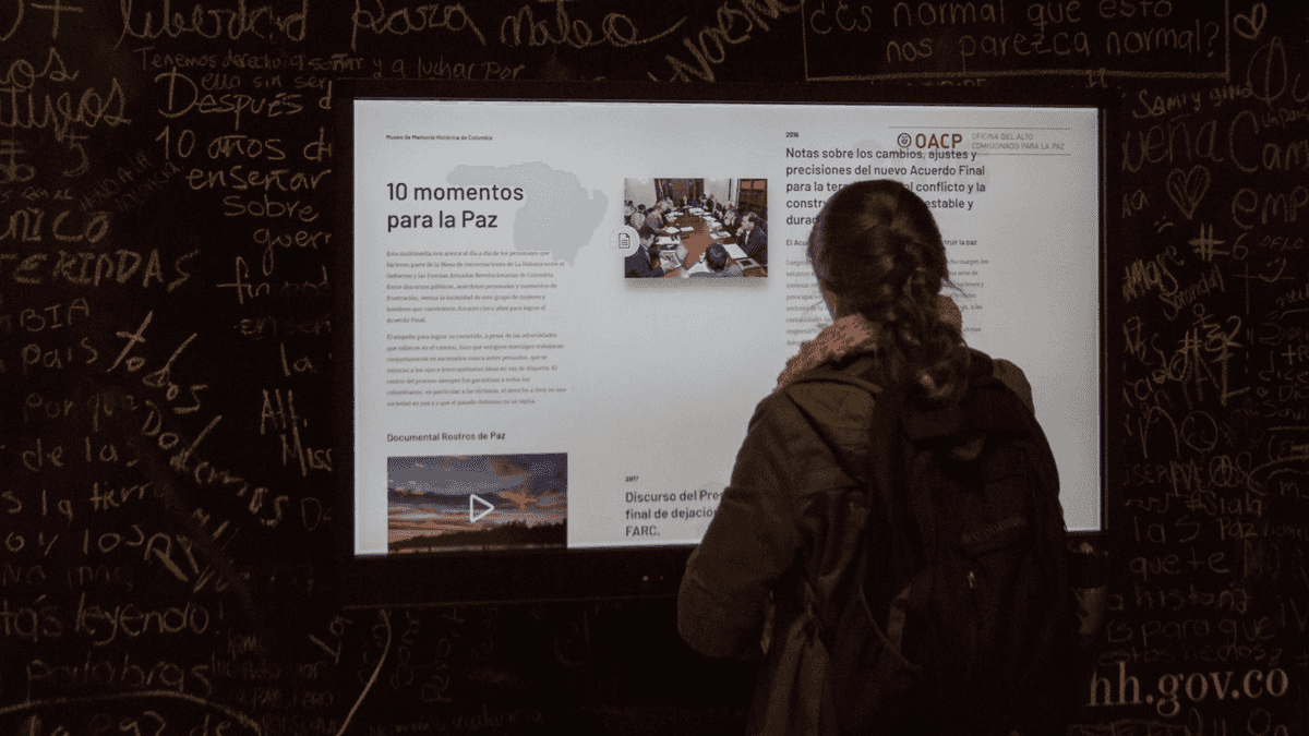
One of the most important things to take into account when building this complementary products was to keep visual consistency between them, helping users identifying them as part of the museum's ecosystem. We mainly focused on achieving this by using the same font family when possible and keeping a unified branding and language.
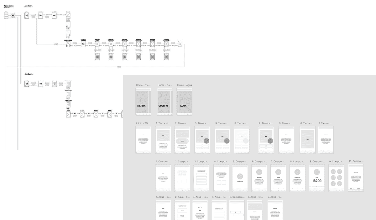
Undestanding Design Systems
At the time, Design Systems were starting to get attention and embraced in different product teams around the world. In the context of our project we weren't to close to this kinds of working methodologies or practical teams. For this reason I also worked in different proposals to bring this quick, agile and iterative methodologies in order to create at least a more cross-platform component library that would allow us to create products faster. I researched about what were the best practices to do this and benchmarked a good amount of global players that had a solid design system. It was a great opportunity to understand the relevance of this type of projects and what a significant impact it has in the way digital products are created and launched.
Challenges
We started with a very conflicted timeline as too many products were promised to be delivered. This forced us to be as efficient and practical as possible in order to get everything done by failing fast and iterating.
Communication was an issue as we were all coming from working alone for a while so creating a collaborative team at the beginning wasn't easy. We managed to overcome this by holding continous alignment sessions that allowed us to both understand each other and aim for the same goal.
Despite being a digital product, process and project management was rudimentary, which didn't allow for too much modern product development methodologies, however, we invested a fair share of our time in researching new ways to build our projects, constantly searching for cutting-edge trends, frameworks and solutions.